
Facing a challenge with your product? Let's have a call, a coffee, whatever works for you.

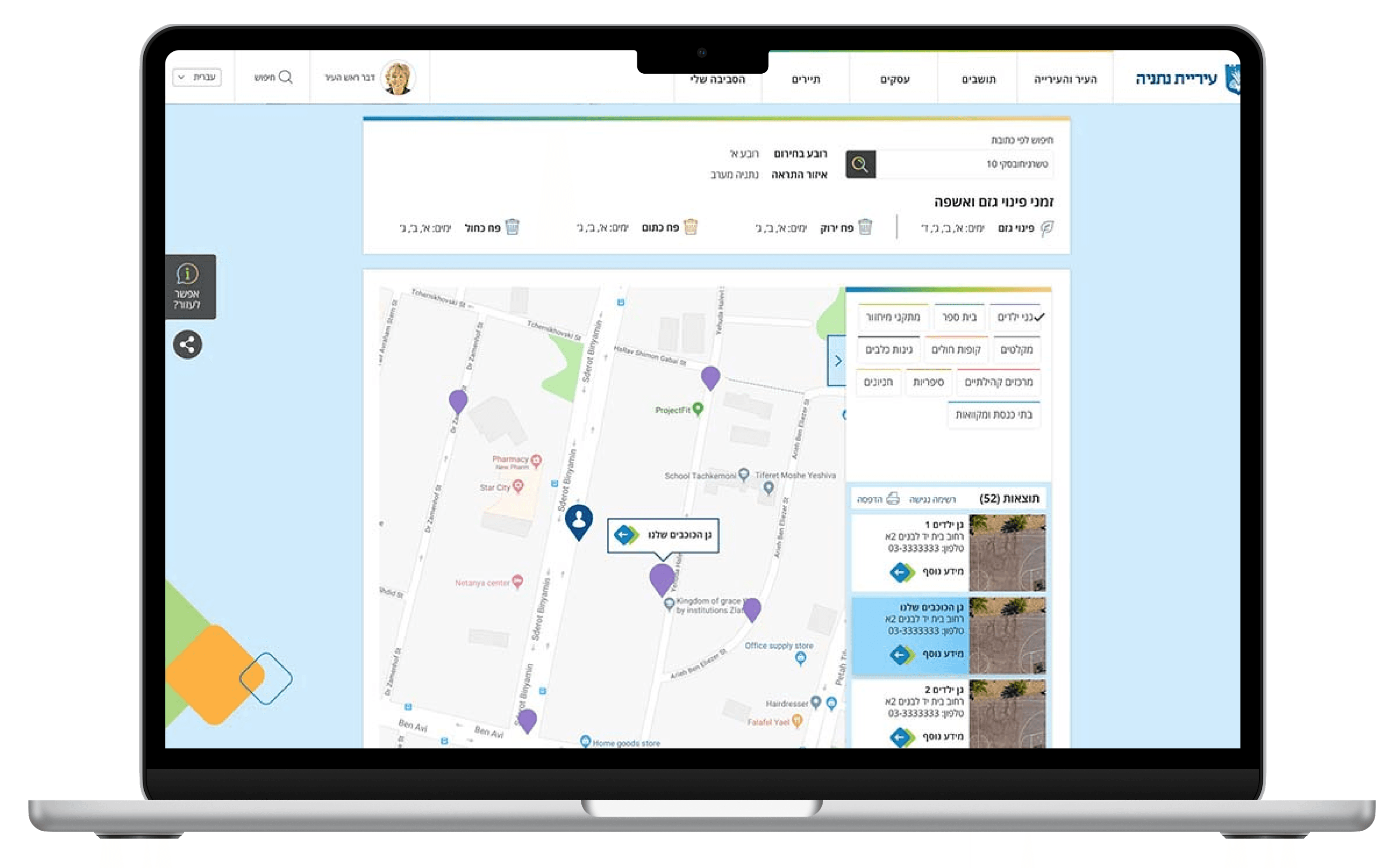
Client: Municipality of Netanya (Israel)
The ask: a single map where you could search more than ten categories of public services — schools, hospitals, parks, waste collection, security cameras, bike lanes.
What we did: instead of designing it all at once, we tested each small decision separately before building anything — because in a map with this much information, the problems don't show up until you use it.
01
The municipality's previous site had one map per category, none linked to each other: you searched "schools" and saw schools, "parks" and saw parks. The ask was to unify it all into a single map. It sounded simple. It wasn't: with ten-plus overlapping categories, every interface decision — where the filters go, what happens with 200 pins on screen, what you show on click — changed the entire usability of the product. We solved this by prototyping each decision separately in Axure, testing it with real users before treating anything as final. The result: a map that works with that complexity, and a method that avoided months of rework.
02
Merging ten categories into a map isn't a visual design problem, it's an interaction architecture problem: what you ask first, where each control lives, what happens when the answer has 200 results. None of those decisions is intuitive at a glance — you only notice if they're wrong when someone tries to use it.
So, before designing a single final screen, we built interactive, functional prototypes for each key decision and tested them with users. Not static mockups: prototypes that simulated the map's real behavior, with its filter and results logic. This let us see the usability problems on screen, instead of discovering them after it was built.
03
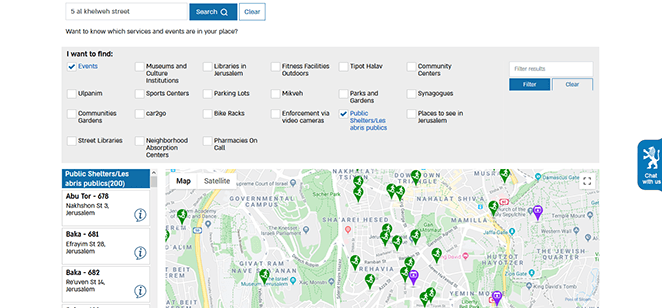
Before inventing a solution, we looked at how those who'd already tried it at scale solved it: Google Maps and other municipal maps in Israel. We found two possible approaches — choose categories first, or search the address first — and tested both with 20 users. Asking the user to choose among ten categories before searching turned out to be the worst path: people got lost scanning options and forgot what they'd come to look for.
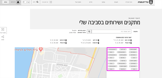
Placing the filters in a horizontal bar seemed simpler — it followed the natural order of steps — but tested with users it lost to the side bar: people scroll until the map fills the whole screen, and at that point a horizontal bar is out of view. The decision was made with real usage data, not aesthetic preference.
With multiple categories active, the map could show hundreds of overlapping pins. We solved this with color by category and a numeric indicator when several items share a location (a school and a recycling center at the same address, for example). The descriptive tags the municipality wanted always visible were tested and overloaded the map — we resolved them with hover on desktop instead of forcing them on screen.
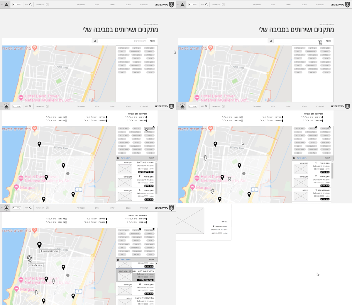 Pin behavior: color by category and numeric grouping
The municipality wanted the results list, once an address was searched, to show all matches in the city, not just the nearby ones. We argued against it: that confuses the user, who might think all those places are in their area. We proposed separating "in this area" from "rest of the city." The client insisted on their version and it was built that way — we put the disagreement on record and moved on. You don't always win that argument, and being honest about it is part of how we show the work.
04
A functional map that holds more than ten simultaneous categories without becoming illegible, built on an existing style guide so we didn't reinvent components. But the most important asset wasn't the final map: it was the method. Prototyping each decision with real functional logic — not mute wireframes — let us catch and fix usability problems before they reached production.
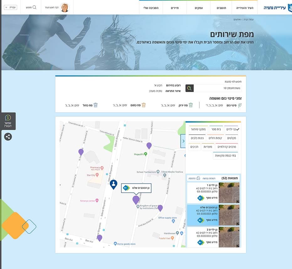 UI final design.
05